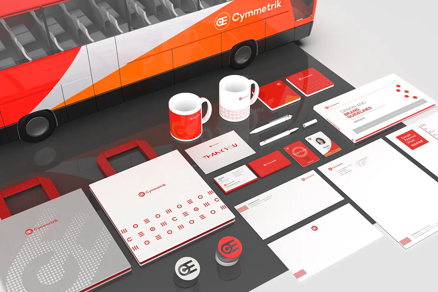

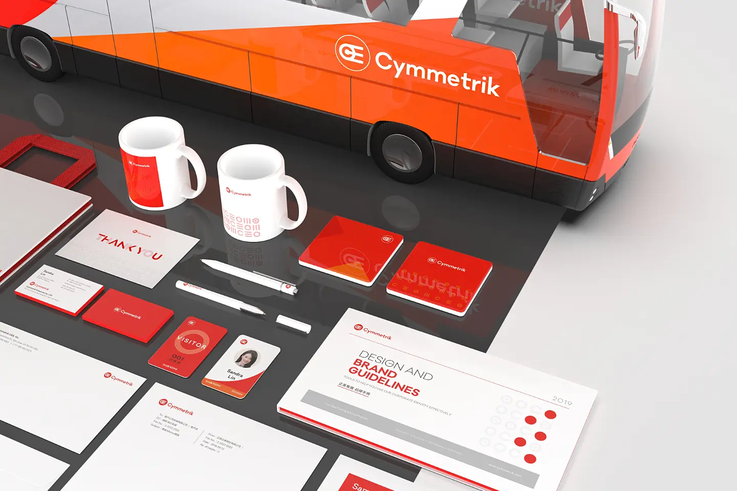
To celebrate the 50th anniversary of Cymmetrik, we proposed a new brand identity design concept to strengthen its industry position and showcase its innovative spirit.
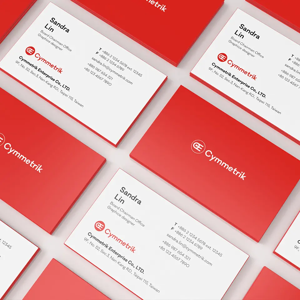
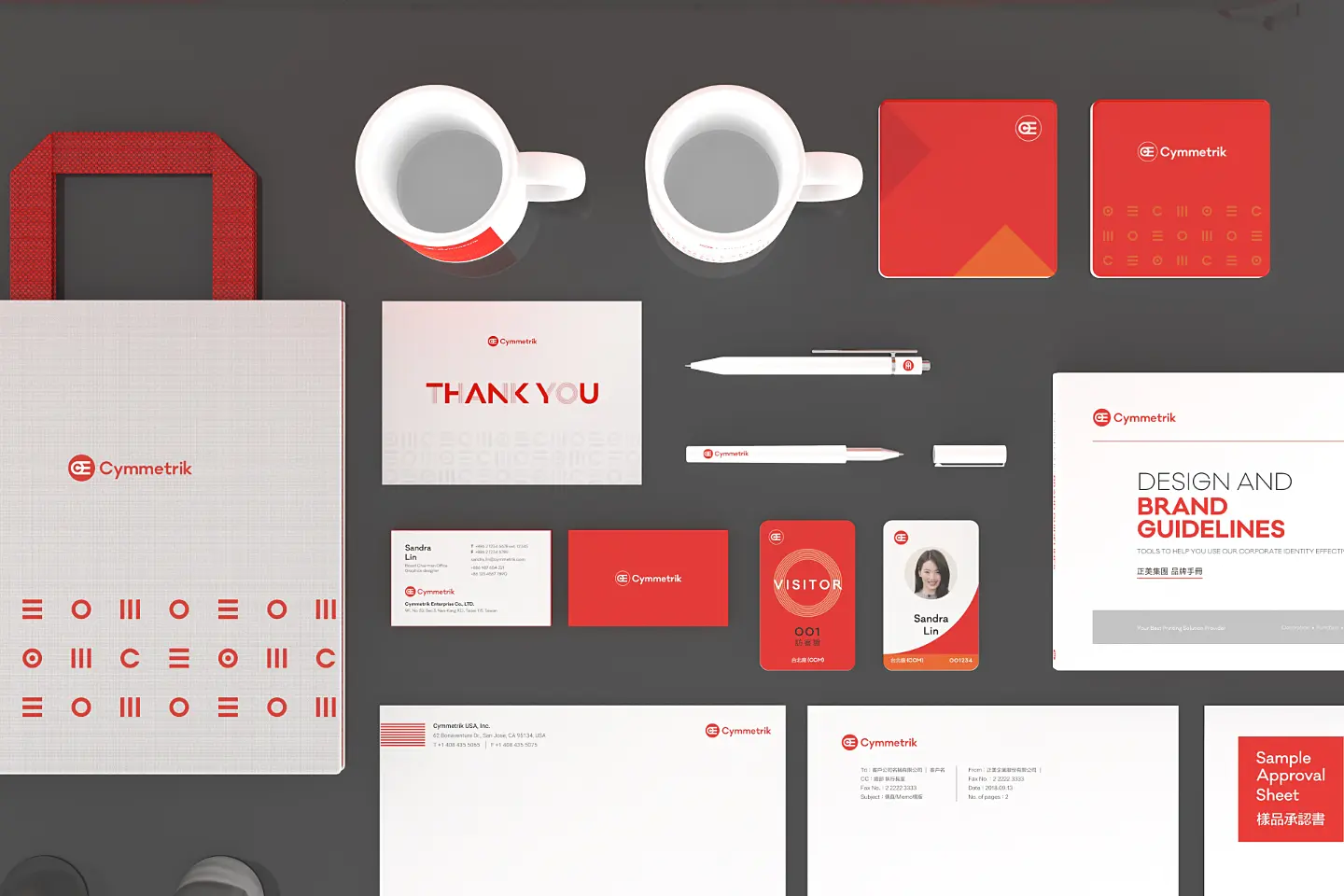
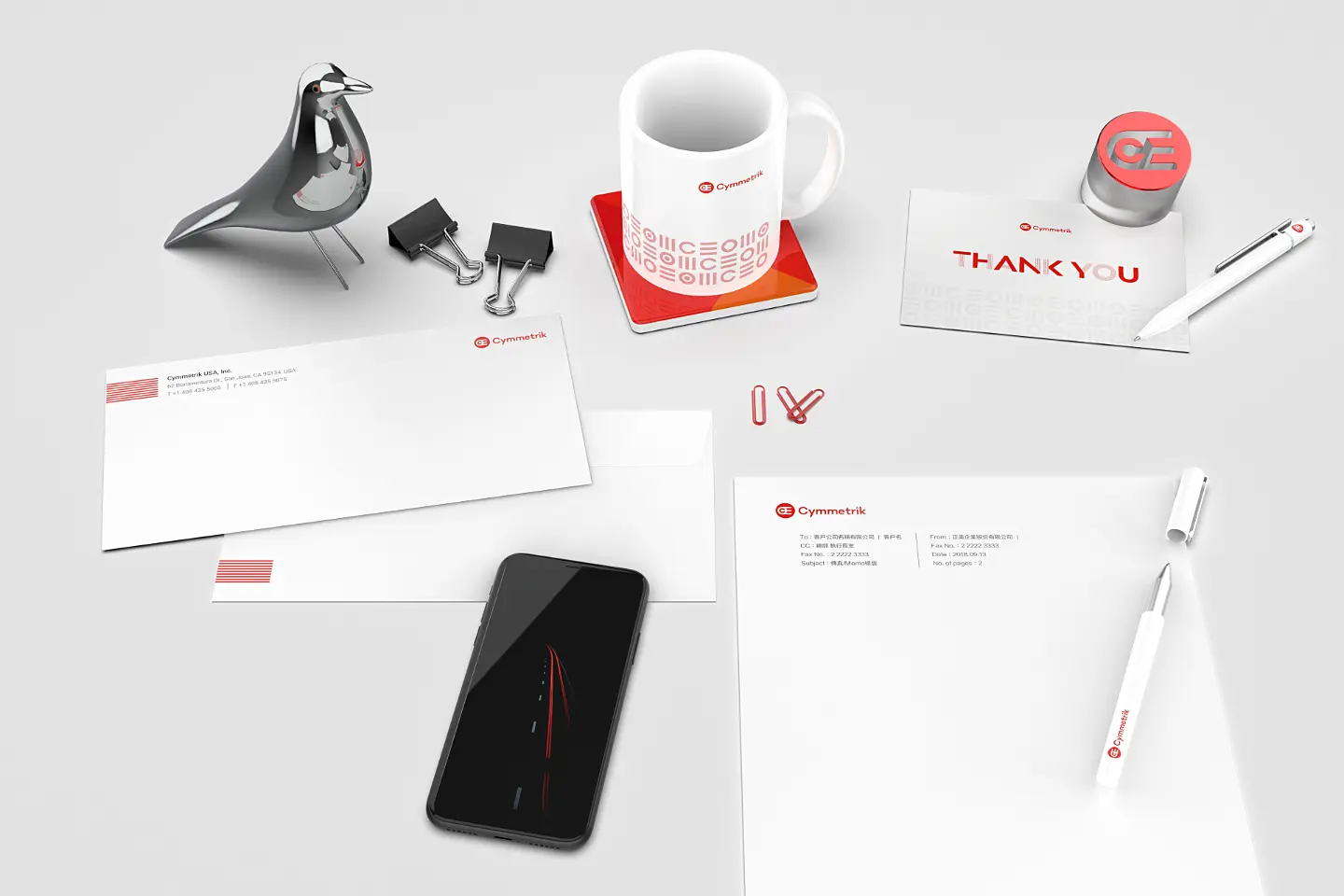
This brand identity update is not only a visual update but also a reconfirmation of the brand’s spirit and values. The new corporate identity inherits the original design elements and meanings, retains the existing identity, and optimizes and upgrades the original logo to make the font more rounded and delicate. At the same time, the brand readability is improved by adjusting the capitalization. The new logo is also extended to develop auxiliary graphics for brand identity, which can be applied to various brand-related visual designs to make the overall brand image more youthful.
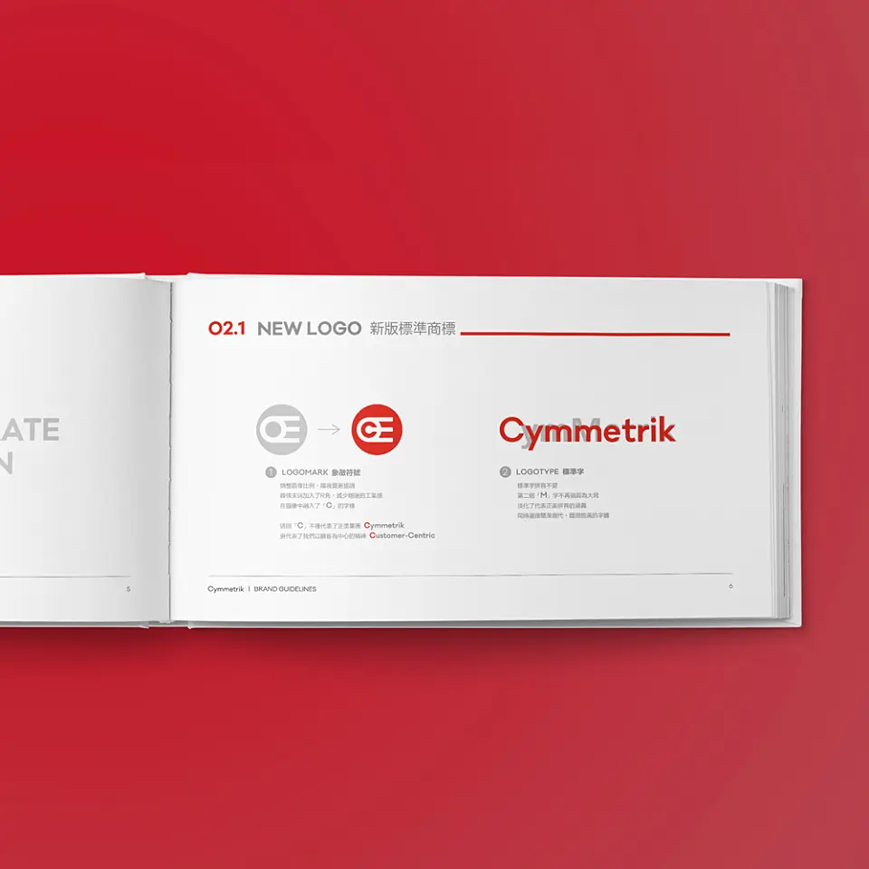
In the symbolic part, the “C” image is added, which not only makes the visual more coordinated but also has a more important meaning. This “C” not only represents Cymmetrik but also represents the spirit of Cymmetrik, which has always been customer-centric.